TailwindCSS and Vue - a Match Made In Heaven

In the days of CSS frameworks such as Bootstrap, Foundation, and Bulma the emphasis was always on components. The frameworks would provide modals, tables, tabs, navigation menus, dropdowns alongside a structured layout system and the occasional helper class. The patterns works well as it lets developers slide in a simple <div class="modal">Modal content</div> where is necessary. There was always the occasional problem with overwriting the styles or fighting the layout of the framework but it was a system that has worked for many people.
Web development has continued to evolve over the years and the rise of component-driven development is very popular. Frontend and backend web technologies such as Vue, React and even ASP.NET core have adopted and helped spread the idea of modularized components. The idea of separation of concerns and single responsibility have shifted in web development from one technology (CSS, HTML or js) to one component.
Enter Utility-First CSS Frameworks
Utility-first frameworks aren't exactly new. Tachyons entered the scene in late 2014 and gained a cult following. That's not to say it didn't have its detractors. Many people bemoaned the utility-first style, called it dirty CSS in HTML, disagreed with the terse class names. It was more than likely Tachyons was in the wrong place, at the wrong time.
It was in July 2017 that TailwindCSS was birthed by Adam Wathan and Jonathan Reinink with design input by Steve Schoger. Tailwind had a quick rise in popularity gaining developer mindshare and eclipsing Tachyons as the utility-first CSS framework of choice.
Tailwind has a beautiful design system, classes that are easy to remember and closely map to the underlying CSS. If you haven't given Tailwind a shot yet you should try it to see if you enjoy the small bundle size it delivers while making you feel very powerful. And now is the time to try it...
Why now?
One of the biggest gripes against utility-first CSS is that there is a lot of repeated CSS classes. Let's take a very simple button example
    <button
      type="button"
      class="bg-blue-600 hover:bg-blue-700 text-white font-bold py-2 px-4 rounded tracking-wider">
      Click me!
    </button>
I can hear you thinking, "What the hell?! I'm never going to type all those classes every time I want to use a button." And I don't blame you. Nobody would want to type that mean CSS classes, it's too much. Every time you wish to change a button on the site you would need to find every instance of a button. Then, change the classes that need adjusting on all of them.
Tailwind does provide a way via the @apply directive to group these classes at build time. So your multitude of classes that come together to create a button are renamed simply .btn
.btn {
  @apply bg-blue-600 text-white font-bold py-2 px-4 rounded tracking-wider;
}

.btn:hover {
  @apply hover:bg-blue-700
}
This is better, it gives us a way to reference our button and a single, centralized location to update the CSS if we ever need to make a change. Much better than hunting down a ton of different buttons.
Is a Button Ever Just a Button?
Rarely is a button just a button, or a card just a card. There is always some need for customization whether that is for loading state, error state, custom error message, a lot for an icon, an even emitted to the parent. A button is never just a button.
Instead of using the @apply why not harness the power of modern development and create a component that is our <custom-button> in a Vue.js component.
In the HTML we can define our static classes directly onto the button class. But for anything that is based upon a prop or somehow dynamic we'll use a computed property, in this case, computedClasses. We've also introduced an optional slot for an icon use the slot syntax.
<template>
  <button
    type="button"
    class="text-white font-bold py-2 px-4 rounded tracking-wider my-1"
    :class="computedClasses">
    <span class="whitespace-no-wrap">
      {{value}}
      <slot name="icon"></slot>
    </span>
  </button>
</template>
In our js, we set up some props to make available to consumers of our custom button. Value, error and loading are examples but there could be many other possibilities such as size constraints, colors, outlined or filled.
Next, we set up a computed property to change the background to red if the button is in an error state according to the prop value.
<script>
export default {
  props: ["value", "error", "loading"],
  computed: {
    computedClasses() {
      return {
        "bg-red-600 hover:bg-red-700": this.error,
        "bg-blue-600 hover:bg-blue-700 ": !this.error
      };
    }
  }
};
</script>
With the <custom-button> file now in place, we can call the button from anywhere else in our application.
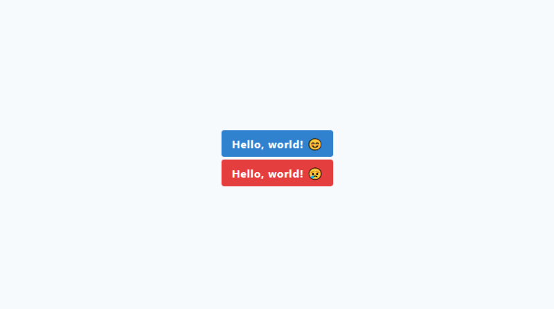
    <custom-button value="Hello, world!">
      <template #icon>😊</template>
    </custom-button>

    <custom-button value="Hello, world!" :error="true">
      <template #icon>😢</template>
    </custom-button>
We get all the benefits of using a utility first CSS library while nicely encapsulating the Tailwind classes in a component. This pattern is very useful and lets you create highly customizable components that suite your needs rather than whoever developed the CSS framework. The HTML, CSS, and js are now in one component with one responsibility, being your button.