Apexcharts and Vue
Apexcharts comes with a rich set of charts including line, area, bar, pie, bubble and also includes specialized charts such as mixed charts, heatmaps, and sparklines. All of these are available through an API that is mostly consistent across the chart types and provides an extensive set of customization options. The library is still also actively maintained and the author provides consistent improvements and fixes to an already great library.
Apexcharts comes with a rich set of charts including line, area, bar, pie, bubble and also includes specialized charts such as mixed charts, heatmaps and, sparklines. All of these are available through an API that is mostly consistent across the chart types and provides an extensive set of customization options. The library is still also actively maintained and the author provides consistent improvements and fixes to an already great library.
Additionally, Apexcharts provides integrations for Vue and React. In this post, we'll go over using the Apexcharts Vue component to create a few different charts and tweak their settings.
Find a CodeSandbox with examples at the bottom of this post.
Prerequisities
In order to get started, you should already have a Vue project created and ready to go.
Install Apexcharts and the Vue component into your Vue project
npm install --save apexcharts
npm install --save vue-apexcharts
The Apexcharts instructions tell you to register the Vue component globally. Due to the size of the charting library, I do not recommend this approach. Hopefully, you are using code splitting by the route and then load the Apexcharts Vue component into only those routes that need charts.
import VueApexCharts from "vue-apexcharts";If you install globally the library will greatly inflate your bundle size for something you may only need for a small portion of your website such as a dashboard.
Creating the first chart
To get started let's start with a simple line graph with some pre-defined data.
import VueApexCharts from "vue-apexcharts";

export default {
  components: { VueApexCharts },
  data() {
    return {
      chartOptions: {
        xaxis: {
          type: "datetime",
          categories: [
            "2019-01-01",
            "2019-02-01",
            "2019-03-01",
            "2019-04-01",
            "2019-05-01",
            "2019-06-01",
            "2019-07-01"
          ]
        }
      },
      series: [
        {
          name: "WebsiteHits",
          data: [15, 20, 21, 25, 60, 120, 93]
        }
      ]
    };
  }
}
In our Vue component, we can define an object chartOptions and an array of objects series.
The chartOptions object is where we can define all of our options for the chart that Apexcharts makes available. In this example, we are just defining the xaxis as a datetime and providing some static dates for the axis to use as categories. Rarely, is an example so simple though and Apexcharts will allow you to customize colors, the toolbar, axis, legends and much much more all within the chartOptions object.
The series array is how we define the plot points for the chart. In this example we are just defining one series called WebsiteHits which is an array of numbers.
Finally, we need to pass 4 props to the apexchart component. Specify a height or a width, a type, and pass in the options and the series data.
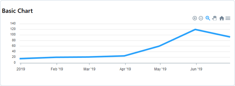
<apexchart height="200" type="line" :options="chartOptions" :series="series"/>In the end we'll end up with a chart that looks like this.
Alternative ways to work with series data
Apexcharts is great in that it gives you a few ways to provide series data. Some of these may work better than others depending on your chart selection and the shape of your data.
Above we had split the categories from the actual series data. This works ok and is even required for mixed charts. For a simple line, bar or area chart one of the following ways of structuring the data can often make things easier.
Paired arrays
Apexcharts will accept a 2-dimensional array of values for the series data. In a 2-dimensional array, the first value of the children will be the x-axis category and the second value will be the y-axis value.
[[1, 50],[2,55],[3,60]]Objects
Objects are a great alternative as they allow you to directly tie the value to an x-axis with well labeled keys.
          data: [
            {
              x: "01/01/2019",
              y: 33
            },
            {
              x: "02/01/2019",
              y: 35
            },
            {
              x: "03/01/2019",
              y: 55
            }
          ]
The data is now in one place with clearly defined x and y values that make it easy to see and understand what is happening with the data.
Map is your friend
More often than not the data you will be working with will not fit nicely into one of the molds that Apexcharts expects. Shaping the data to fit into one of these molds is the core of the work involved in getting up and running with this charting library.
The JavaScript array map function is instrumental in shaping data into a format that can be consumed by Apexcharts.
Let's take a look at a stock API example where we receive an array of the following data.
const stockData = [
  {
    "date": "2018-01-03",
    "open": 168.6028,
    "high": 170.5768,
    "low": 168.0458,
    "close": 168.3096,
    "volume": 29517899,
    "unadjustedVolume": 29517899,
    "change": -0.029317,
    "changePercent": -0.017,
    "vwap": 169.1736,
    "label": "Jan 3, 18",
    "changeOverTime": 1.0448157219500815
  }
  // ...More objects
]
If we wanted to create a basic line chart containing the date and the close we can shape this by using map.
const parsedStockData = stockData.map(s => {x: s.date, y: s.close});We now have an array of objects we can pass to the Apexcharts component.
const series = [
   name: "Close Price",
   data: parsedStockData
]
What if we wanted to use Apexcharts OHLC (Open, high, low, close) candlestick chart? We can change the map function to return the shape of the data required by Apexcharts for a candlestick chart.
const candlestickData = this.stockData.map(d => {
        return {
          x: new Date(d.date),
          y: [d.open, d.high, d.low, d.close]
        };
      });
The y value provided by our map function should be an array of values that follow the pattern of: open, high, low, close.
Wrapper components
Typically, I like to create wrapper components on top of Apexcharts. Wrapper components allow you to provide a sensible set of default options for your project such as providing a theme or specifying axis options. Consistency is an added bonus. Being able to be consistent without having to remember to redefine those options on all of your charts.
Furthermore, wrapper components can help consistently shape data by providing computed properties or helper methods to parse data. This is especially helpful when charts are going to be shown on different views. Parent components should not need to worry about how the data is parsed into the chart and rather can provide their data to the wrapper component and let it handle the parsing in a consistent manner.
